
Lighting and Media Design Part 1
This blog series offers a multi-disciplinary approach to achieve the best practices for collaboration in the creative and production process of incorporating digital media into live performance.
No matter the final display option we choose, all of the choices for presenting video or still imagery in live performance incorporate light for the content to be visible. There are self-emitting light sources such as video walls, LED curtains/panels, TVs, AR/VR, etc. There are also light sources that can beam the content onto other pieces of physical architecture/screens, such as projectors. The media designer and the lighting designer must work together to integrate these additional types of media light sources with the lighting department’s traditional incandescent and LED lighting instruments, fluorescents, practicals, etc. in order to achieve a unified design.
Because lighting and media design fundamentally deal with lighting, a lot of productions and educational institutions include video/media under the realm of the lighting department. Many rock & roll concerts, corporate events, and regional/educational theatres combine the role of lighting/media designer. It is an obvious first choice, as both departments are dealing with light; however, most lighting designers are not usually video designers, or digital media content creators. If the media content is going to be dramaturgically important to the story, I advocate having a separate media designer.
Most lighting designers are not usually video designers, or digital media content creators.
Projections
Of all the various forms of presenting digital media in a live performance, projections bare the closest resemblance to lighting design. A projector is the closest piece of gear that a media designer has in her tool kit akin to a lighting instrument. When using a projector, designers contend with many of the same properties as a lighting instrument, including color temperature, color palette, brightness, throw distance, angle of light, and light cone.
Color Temperature
It is important to note that the choice of projector and lighting instruments will directly impact how the color temperature between these light sources match. Traditional incandescent lighting instruments cast a warm color temperature, while projectors tend to have cooler color temperature. This means that getting the quality of light to look the same is nearly impossible, because it is a foundational difference between the types of light sources. One way around this is to use LED lighting fixtures, which have a cooler color temperature. It is more expensive, but the color temperature between the lights and the projections will match more closely. There are some tweaks the media designer can make to warm up an image, but it will never correspond directly with an incandescent lighting instrument.
This is important to know going into a production. If it is crucial for the aesthetic of the show to have the color temperatures match, making it look and feel like the images and lighting live in the same world, it must be stated upfront. Know that it will require extra time and attention while making content and when in tech; so plan accordingly with your scheduling.
Color Palette
Color palette is a really important part of the collaboration between media and lighting designers. Oddly enough it is often overlooked. Traditionally, designers try to work with similar or purposefully contrasting color palettes to create a unified design. Yet it is common for media’s color palette to be disregarded by all departments, including the director. I think this is because most professionals don’t have a lot of experience working with media design and they think it is some sort of black magic, a dark art (which of course it is!). Since they do not understand how it works, they stop applying traditional design fundamentals to this area. This is evident onstage when projections need to live within the same world as the lights and do not because no one considered color temperature or color palette. Don’t be afraid to ask the media designer about color and how it applies to storytelling. Some things to consider are:
- Will an overall color grading, such as sepia, be added to all video?
- Will there be a purposeful muting of colors?
- Will x-color pop and glow?
- Will the color palette change over time?
- How can we unify our colors among departments?
- How is media design treating color to help tell the story, or create a mood?
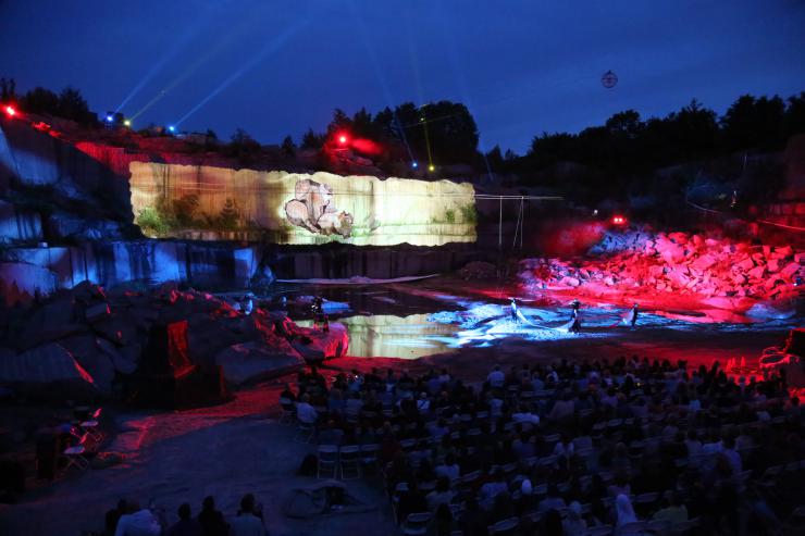
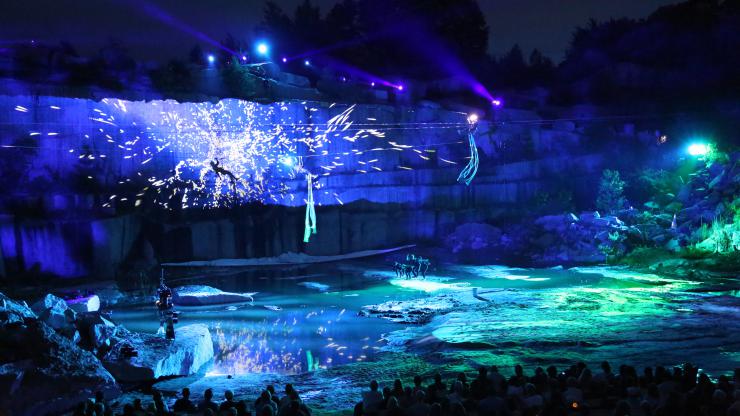
The answers to these types of questions are just as important as similar questions in all other design departments. Yet, sometimes it isn’t always easy to decide color palettes for projections in advance. I was co-media designer with Matthew Ragan on a production of Terra Tractus, for which we worked extremely fast. We created all the content for a one hour plus show in just a little over two weeks with a department of three. We projected onto the stone surface of a rock quarry, so there was a lot of trial and error in terms of finding the right colors that looked good on the stone. Lighting designer Jamie Burnett used mostly LED fixtures for the show, allowing him to easily change the color of his lights on the fly, versus needing to decide weeks in advance if he had used gels. This freed up the media design team so we did not need to be restricted by color, which was difficult for us to ultimately get 100% correct until we were at the venue. Because of the ease at which lighting could make color adjustments, we decided that lighting would play off of media, basing the color palette off of the projections. Sometimes Jamie matched the color palette of the projections and other times he played against it, creating contrast with an opposite palette.
I have also working in reverse on productions, where the lighting department was using incandescent instruments with gels, so it was easier for projections to match color to lighting, manipulating the color within the media server and when needed by re-rendering content. No matter how you ultimately decide to work, it is good to have a discussion between the two departments well in advance of tech to create a smooth and versatile work flow that fulfills all the needs of the story and the production.
I believe these issues of brightness, color temperature, and color palette are why many lighting designers don’t like to work on shows with projections. They feel that they are there to illuminate the performers, and create a mood and set a time of day, not dim down their art to accommodate projections.
Brightness
The projector light has to cut through all the stage light in order to be seen. In too many regional, small professional and educations venues, the projectors used just don’t have enough lumens (brightness) to provide the needed punch to pop out amongst all the stage light. This is because projectors with enough lumens to do the job correctly cost substantially more to purchase, run, cool, maintain, (cost of bulbs, etc.) or rent, than their cheaper, lower lumens (less bright) cousins. To achieve the needed brightness, designers will double stack projectors (two projectors beaming the same image on top of each other) in order to double the brightness. This costs additional money because it requires two projectors for every one needed, doubling the amount of total projectors required and the costs associated with running them. Typical stock projectors for most small to medium venues are usually somewhere between 5,000-8,000 lumens. When viewing images in a dark theatre, this is usually bright enough. But as soon as the lighting designer starts turning on all her instruments, it gets dim really quickly. The total brightness of all those lighting fixtures make the projections seem dimmer in comparison, and will also wash out the projections, diminishing the contrast and making them seem more flat.
Unless you are working on a production that has the budget or the resources to obtain bright projectors, there is going to be a dance between projections and lighting. The media designer is often asking the LD to lower the overall intensity of the lights and/or cut some lighting so it doesn’t spill onto projection surfaces. It rarely works in the opposite direction where the LD asks for the projections to be dimmer. Someday, a lighting designer will ask me that question and I can’t wait.
I believe these issues of brightness, color temperature, and color palette are why many lighting designers don’t like to work on shows with projections. They feel that they are there to illuminate the performers, and create a mood and set a time of day, not dim down their art to accommodate projections. So, how can we avoid this dance? This battle between these two departments can be addressed somewhat in the planning stages.
Enter the scenic designer and the director…
Up Next: Lighting and Media Design Part 2
This blog series offers a multi-disciplinary approach to achieve the best practices for collaboration in the creative and production process of incorporating digital media into live performance.


Comments
The article is just the start of the conversation—we want to know what you think about this subject, too! HowlRound is a space for knowledge-sharing, and we welcome spirited, thoughtful, and on-topic dialogue. Find our full comments policy here
A very informative article and important. Just finished directing a production of THE OTHER PLACE, which definitely have projections, so know from experience the importance of having a LD and media designer working together for the common food of the production. I remember brightness of projections definitely being a concern. All turned out well though. Had a great production team.